Let’s Get Literal (LGL) is a fun, interactive series of designs based on “literal” interpretations. LGL combines several things we love – movies, design and creating campaigns that delight and engage people. This year’s calendar theme is MOVIE TITLES and it’s up to the end-user to guess and then check their answers at LetsGetLiteral.com.
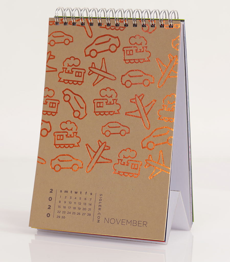
November’s design was inspired by straightforward simplicity.
- Designer: Gabe
- Movie Title: Planes, Trains and Automobiles
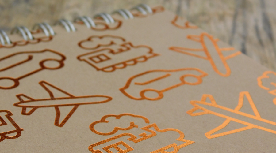
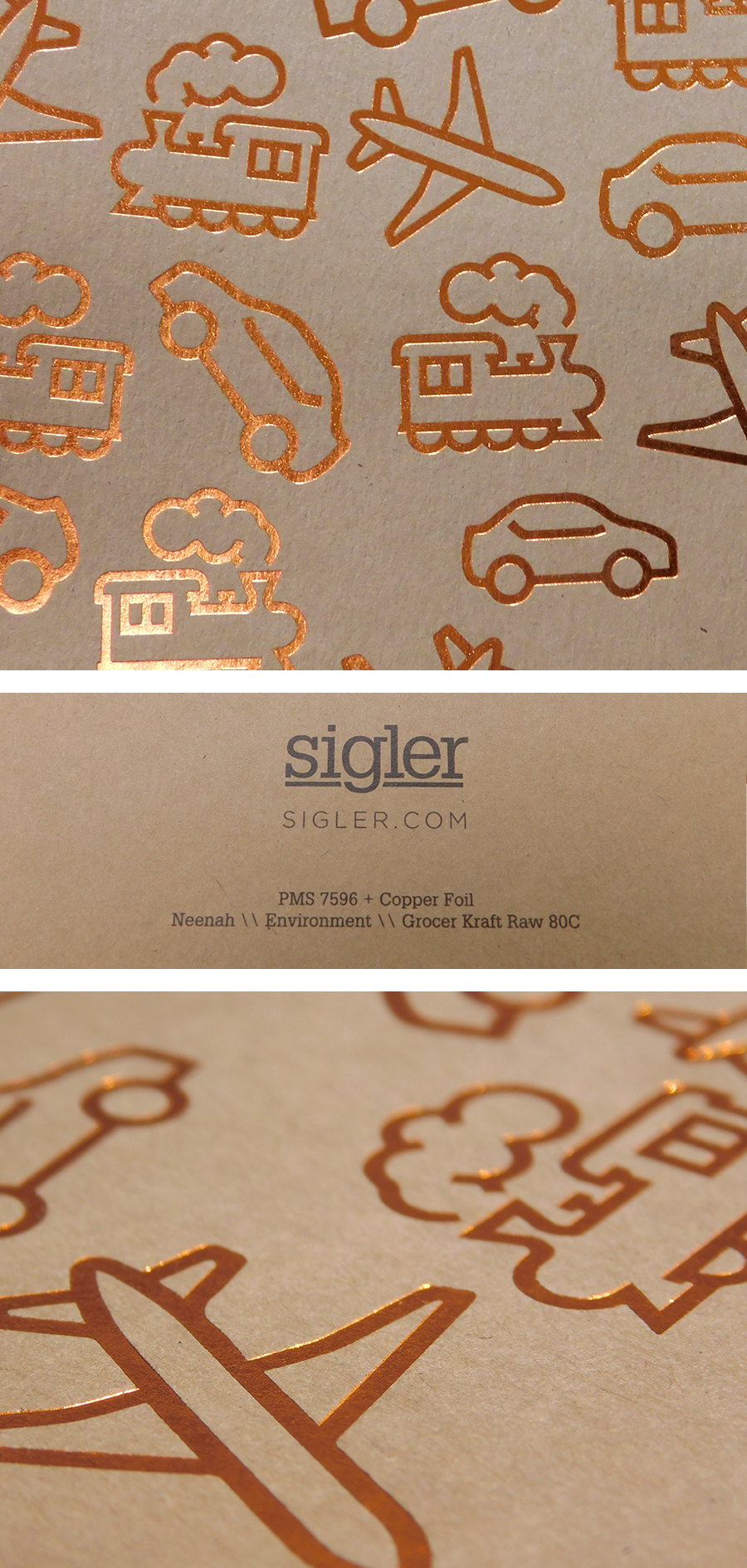
- Design Style: Custom pattern
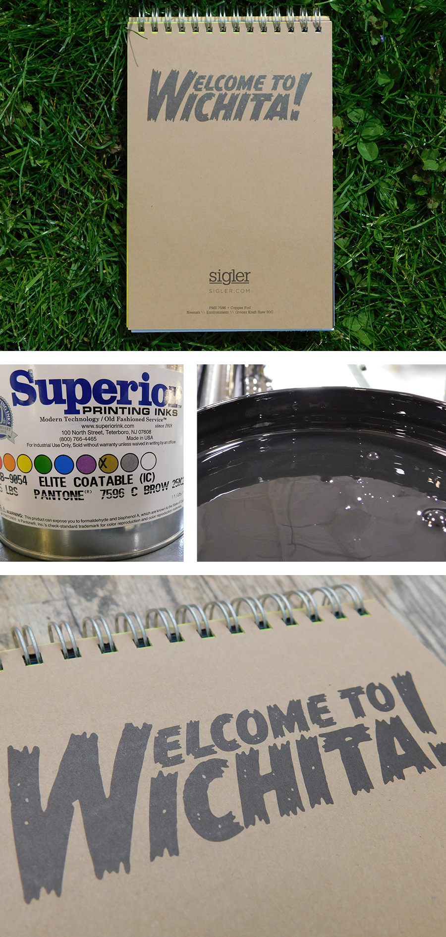
- Ink: PMS 7596 + Copper Foil
- Paper: Neenah Environment®, Grocer Kraft RAW®, 80C
Designer’s Commentary with Gabe
If you saw my commentary on the Ace Ventura design you’ll already know that I. LOVE. MOVIES., and this movie, Planes, Trains and Automobiles, is no exception. But compared to the exasperating and disastrous vehicular adventures of Neal Page and Del Griffith, developing and designing a literal interpretation for this movie was a Sunday afternoon stroll! I mean, the title IS Planes, Trains and Automobiles, so it wasn’t too far of a leap to figure out how to represent that literally.
BUT not so fast, the challenge came when I asked myself the question of “how” to represent it. Should I go with a photo or an illustration? An over-sized design or perhaps something more minimalist? A realistic representation or a more interpretive design? Well, I tried out ALL of those options and was left unsatisfied with the results.
Finally, I thought to myself “What design technique have I not used in a while?” and I remembered that it had been a while since I created a custom pattern for anything. So I took a minimalist design concept I already had of a plane, a train and an automobile, and started placing them within a pattern area in Illustrator until I was satisfied with the results – seeking to find the balance between a cohesive and an organic pattern.

Next up was choosing how to produce this calendar design. It was still a simple and minimalist inspired design, but In the spirit of “Hollywood glitz and glamour” we had been choosing foils and special spot UV finishes. So how do I merge those two ideas of simplicity and extravagance? Well, with the help of fellow designer, Heather Cramer, we ended up choosing copper foil to go with a natural “raw” looking paper that she had been wanting to use: Neenah’s Environment® in Grocer Kraft RAW®. When used together they had a natural warmth that worked very well. These finishing touches also lend to the same warmth often felt during the Thanksgiving holiday (the month of this calendar design), and the warmth that we also see in the heartwarming ending of Neal and Del’s story. *Insert emotional music here*


Environment® Papers are available in 14 colors inspired by nature and today’s organic lifestyle. You can choose between either smooth or RAW® textures for the finish. Available in multiple weights. All colors are FSC® Certified, Green-e Certified, Green Seal® Certified and are made with 30% or more Post-Consumer Fiber. For more information and a peek at color options, visit our friends at Neenah.
If you’d like to make your next print project have maximum impact – Sigler's ready to help. CALL US AT 515.232.6997 or jump right in and fill out our project planner.
To download Planes, Trains and Automobiles for your screens, click here.
Didn't receive a Sigler calendar this year? Never fear. Download a free printable version here.

