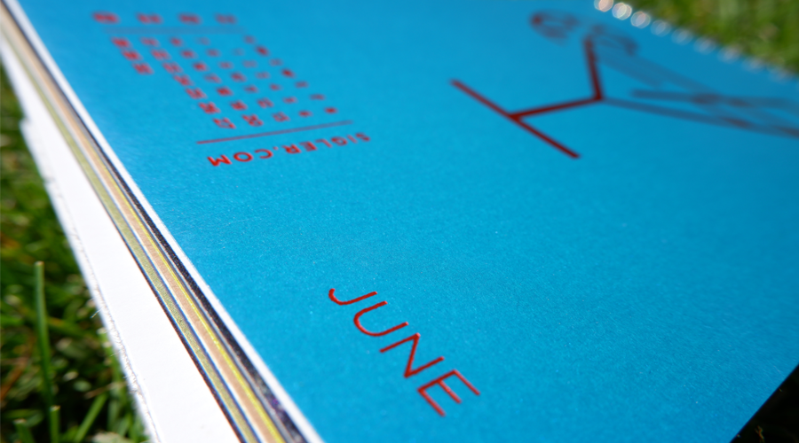
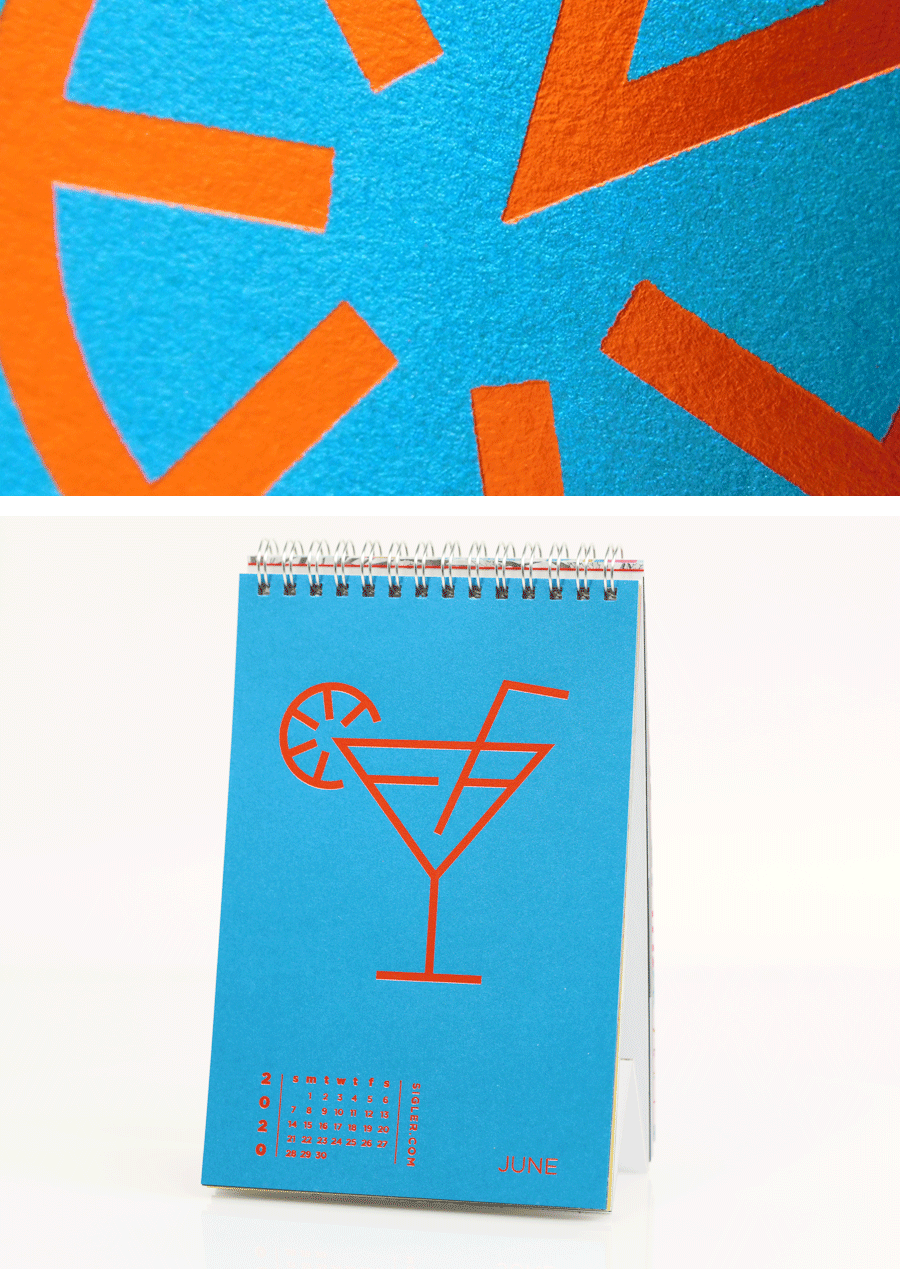
Let’s Get Literal (LGL) is a fun, interactive series of designs based on “literal” interpretations. LGL combines several things we love – movies, design and creating campaigns that delight and engage people. This year’s calendar theme is MOVIE TITLES and it’s up to the end-user to guess and then check their answers at LetsGetLiteral.com.
June’s design was inspired by shimmering paper, Tom Cruise and my fondness for beaches and booze.
- Designer: Heather Cramer
- Movie Title: Cocktail
- Design Style: Minimalist Line Art
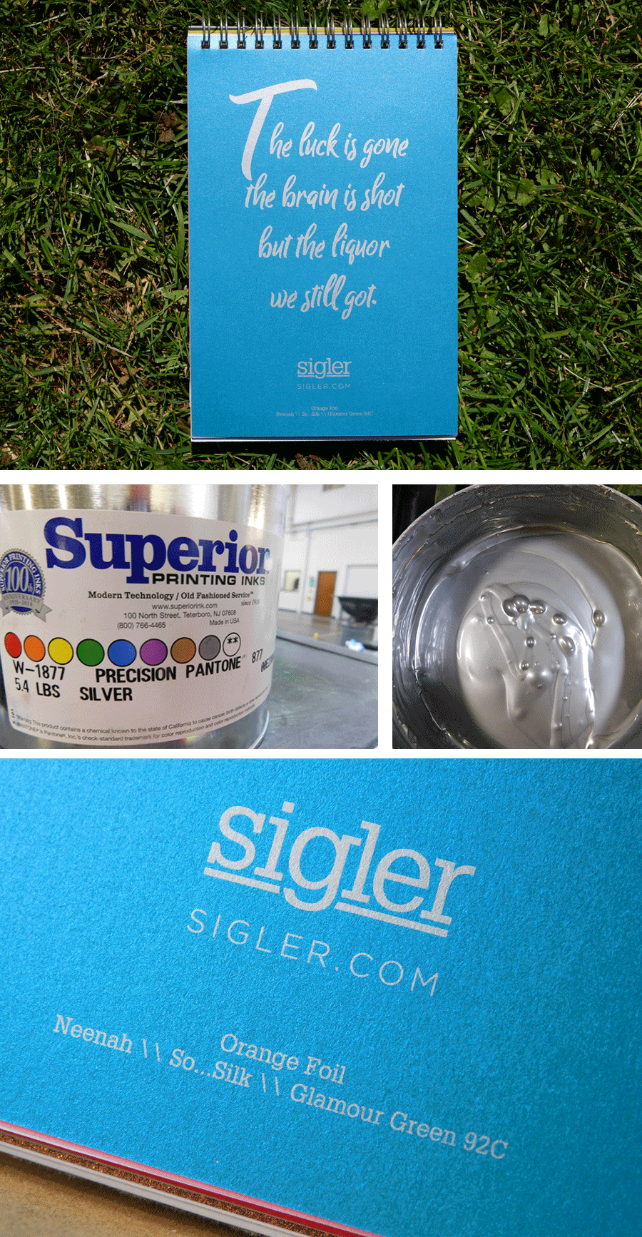
- Ink: Orange Foil / PMS 877 Metallic Silver
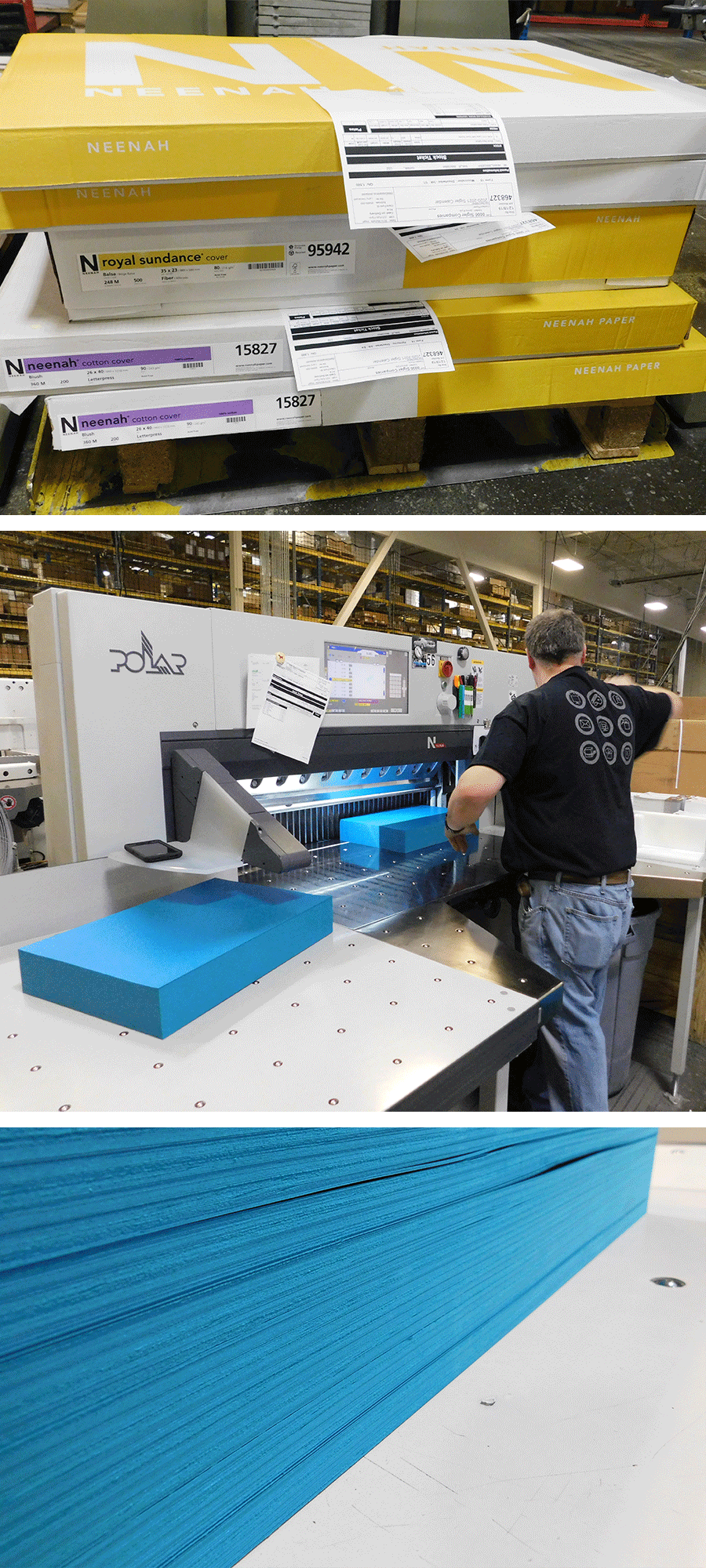
- Paper: Neenah SO...SILK®, Glamour Green, 92C
Designer’s Commentary with Heather
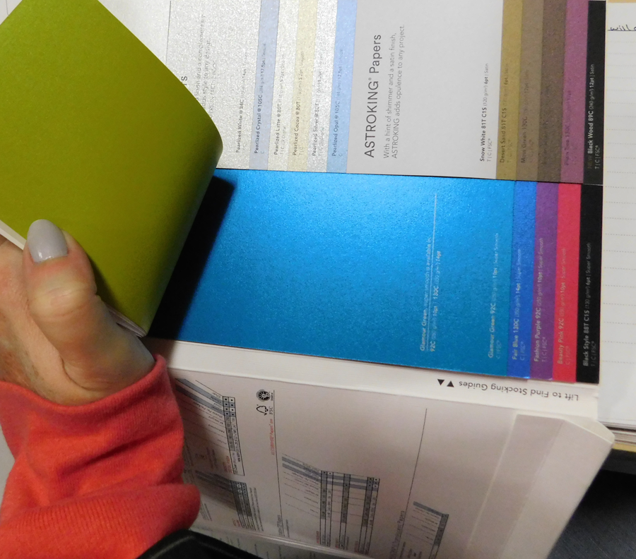
Cocktail’s design was inspired entirely by Neenah’s SO...SILK® Glamour Green paper. I’m a sucker for shiny things. Whenever I would pick up Neenah's “The Design Collection” paper swatchbook, I’d find myself staring longingly at Glamour Green thinking, "Someday, pretty paper, someday I will convince a client to use you!"
In the end, the client ended up being me! This is why I love Sigler’s annual promotional calendar so much. It's our opportunity to experiment, push designs and inspire ideas.
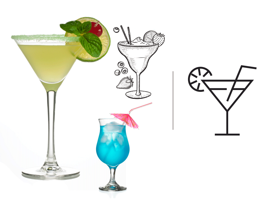
Our preliminary design options went from beautiful photographs of delicious umbrella-laden cocktails, to fun wood-cut style illustrations. We toyed with the idea of using varnish with grit to simulate a salted rim, raised-UV to accentuate the droplets of condensation on the glass or even adding scented varnish on a garnish.
While all of these design approaches would have been cool, in the end, I chose to just let the paper “shine” and take center stage. To achieve a minimalist simplicity, I went with a basic, crisp icon with clean lines.
While the color of the paper is officially called Glamour Green, it reminds me more of a blue you’d find whilst soaking up the sun on the beaches of the Caribbean (with a cocktail in hand, of course). Since the movie Cocktail is set partially in Jamaica, I thought this seemed appropriate.

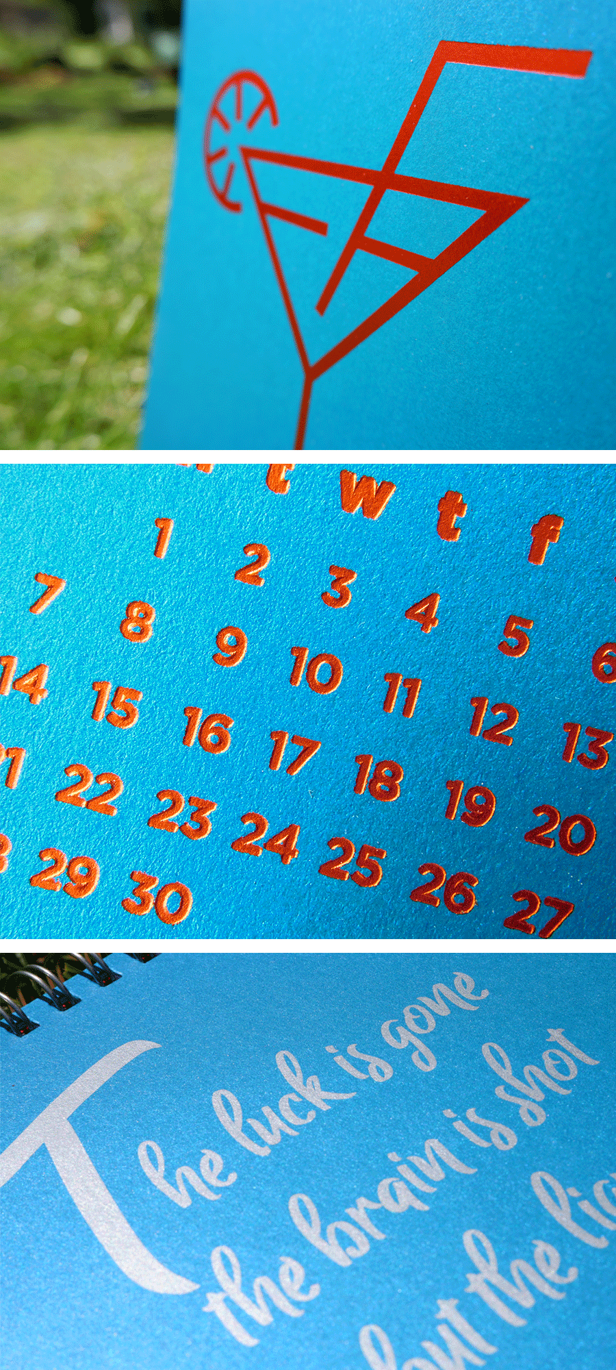
I wanted to use a matte orange foil for the artwork and text to contrast the iridescent paper. When using complementary colors you have to be careful because they often clash instead of “complementing” one another, but I actually wanted this slightly jarring effect. It's a subtle nod to neon bar signs begging you to come belly up to the bar.
When we tested the matte foil – not gonna lie – it looked terrible! It wasn’t quite opaque enough and since it wasn’t a standard color, it was going to take longer to arrive. Since our timeline didn't allow for this, I switched the foil from orange matte to orange gloss. (I highly recommend you request samples before committing to a full run AND if you are on a pretty tight deadline, ensure that the foil you’ve specced is standard and in stock.)

For the quote on the back of the design, I chose the tried and true PMS 877 metallic silver. Perfection. Both the foil and ink performed beautifully on this fabulous paper. If you want to bring some "ooh and ahh" to your next printed piece, SO...SILK® won't let you down. Cheers!

SO...SILK® is available in 8 striking colors with 3 weights. All colors are FSC® Certified. For more information and a peek at the color options, visit our friends at Neenah.
If you’d like to make your next print project have maximum impact – Sigler is ready to help. CALL US AT 515.232.6997 or jump right in and fill out our project planner.
To download Cocktail for your screens, click here.
Didn't receive a Sigler calendar this year? Never fear. Download a free printable version here.

