Let’s Get Literal (LGL) is a fun, interactive series of designs based on “literal” interpretations. LGL combines several things we love – movies, design and creating campaigns that delight and engage people. This year’s calendar theme is MOVIE TITLES and it’s up to the end-user to guess and then check their answers at LetsGetLiteral.com.
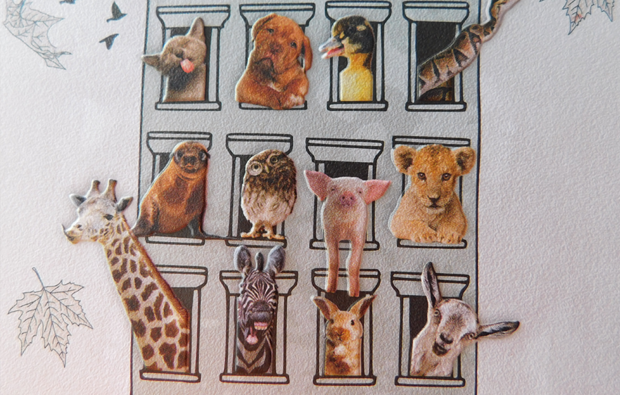
April’s design was inspired by ‘a bunch of animals.’
- Designer: Amy Sengbusch
- Movie Title: Animal House
- Design Style: Illustration combined with photography
- Ink: 4-Color Process + Emboss
- Paper: Neenah CLASSIC® Stipple, Recycled 100 Bright White, 80C
Designer’s Commentary with Amy
The idea for my Animal House design popped into my head right away. I envisioned a house with a ‘bunch of animals’ sticking their heads out of the windows using a design style that combined both illustration and photography. Because of the vertical orientation of this year’s calendar dimensions, I went with an old brownstone house illustration and used photography to create realistic looking animals.
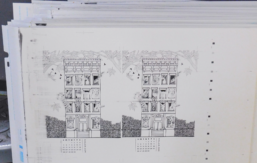
Press sheet before emboss.


To keep our individual calendar pages cohesive, we decided to use Neenah® paper exclusively and were challenged with incorporating a shiny element into our designs – either via the paper itself or with metallic inks or foils. Originally, I was going to use Stardream®, which is a shimmering pearlescent paper, but it just didn’t seem like a good fit for the aesthetic of my finished design. I considered a simple matte white paper with a gloss UV treatment on just the animals, but the idea of the animals being shiny didn’t seem quite right either. What to do?
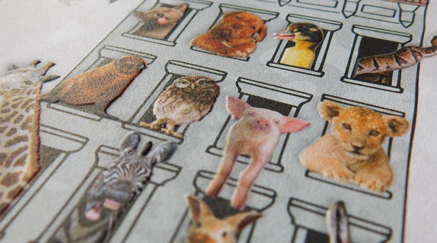
We determined that a shiny element just wasn’t making sense with my design, so in true Animal House fashion, the rules were bent. In the end, I chose CLASSIC® Stipple, Recycled 100 Bright White – a textured paper with a pebbled finish, which offers an authentic feel with a striking tactile effect. It was the perfect match for my muted color palette and enhanced the emboss treatment on the animals making it truly seem as if they were popping out of the windows. I am very happy with the way the design turned out.
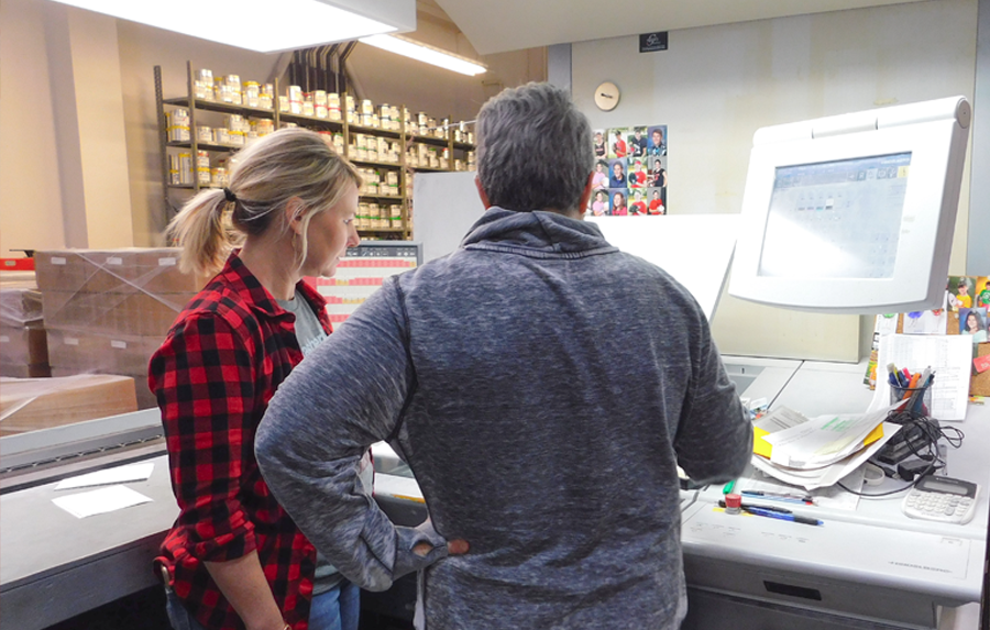
Amy and Jenny press proofing Animal House.

Press plates.
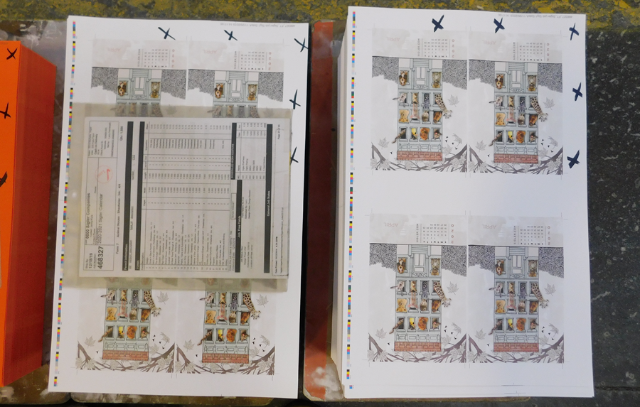
Finished press sheets on the production floor.
Close up showing the emboss effect on the front of the design and Stipple's texture.
 Close up of how an emboss impacts the back of the design.
 Finished calendar page after assembly.

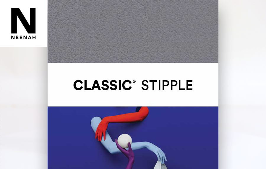
CLASSIC® Stipple comes in 16 different colors with 8 different weights, plus 3 colors and 6 whites that are compatible with digital printing. We love Stipple so keep it in mind for your next project. For more information and a peek at color options, visit our friends at Neenah.
Neenah's CLASSIC® Stipple.
If you’d like to make your next print project have maximum impact – Sigler's ready to help. CALL US AT (800) 750-6997 or jump right in and fill out our project planner.
To download "Animal House" for your screens, click here.
Didn't receive a Sigler calendar this year? Never fear. Download a free printable version here.

