Let’s Get Literal (LGL) is a fun, interactive series of designs based on “literal” interpretations. LGL combines several things we love – movies, design and creating campaigns that delight and engage people. This year’s calendar theme is MOVIE TITLES and it’s up to the end-user to guess and then check their answers at LetsGetLiteral.com.
May’s design was inspired by getting in the "Ace Zone"
- Designer: Gabe Searles
- Movie Title: Ace Ventura: Pet Detective
- Design Style: Vector & Digital Artwork
- Ink: 4-Color Process Digital Printing + Black Foil
- Paper: Neenah CLASSIC® Linen, Solar White, 80C
Designer’s Commentary with Gabe
Alrighty then! A couple things about me … first, I. LOVE. MOVIES. And second, I grew up in the 90s. So when we were given the project of picking a movie to design (literally) I was immediately drawn to the cinematic masterpieces of that era – granted, I may be using “masterpieces” loosely. But with SO many favorites and timeless classics to choose from (from action-packed films to comedies to thrillers and more!) how would I be able to decide? I had to put on my movie-buff hat along with my designer hat, and ask myself, “What movie would lend itself to a fun and literal interpretation, and also be well-known enough to be recognized?” After considering many options I decided that Ace Ventura: Pet Detective was iconic enough to be remembered and incorporating literal aspects of that name would be a fun design challenge. Plus, who could forget Jim Carrey’s comedic performance, physical comedy and face-bending antics? And so, it was in that goofy and unexpected comedic style that I took inspiration for my calendar design.
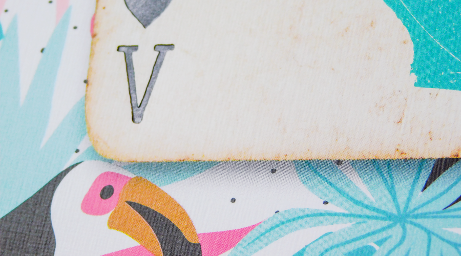
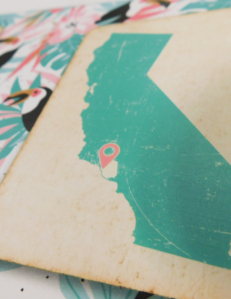
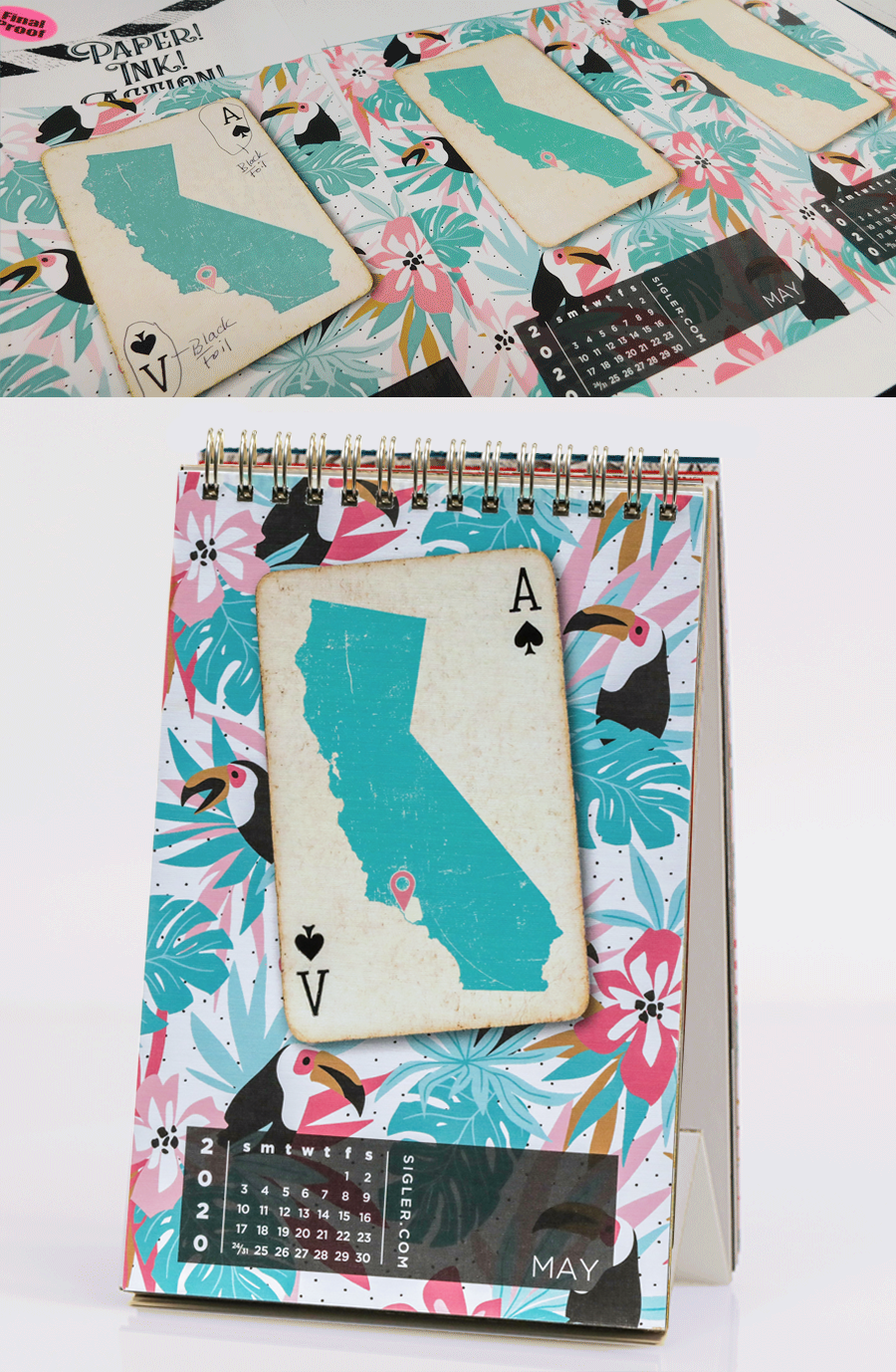
Once I chose the movie, I had to decide what design elements to include to best literally represent this movie. A playing card ace was the easy go-to design element for the “Ace” part of the movie title, and to help further provide a clue to the entire title I added a cinematic “twist” by changing what would normally be an “A” on the bottom left-side of the card, into a “V” for Ventura – clever right? But how could I literally portray “Ventura” as well? Well, another thing you should know about me is that I grew up in California. So my mind went directly to the SoCal city of Ventura, in Ventura County! You can’t GET more “Ventura” than that! I used an outline of California (a very recognizable shape on its own), with a map pin-pointing the city of Ventura, located in an outline of Ventura County.

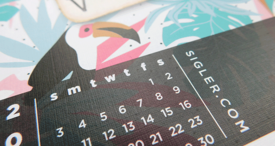
With those design elements mashed-up on the card I still had some space on the page to play with and I wanted to fill it with something that would evoke the spirit and style of Ace Ventura himself. So after watching a few movie clips and getting into the “Ace”-zone (a scary place, I know!), I incorporated his wardrobe of bold colors and Hawaiian shirts by applying a tropical Hawaiian pattern to the background along with some animals as homage to the pets that Ace detects.
This wardrobe inspiration led me to choose Neenah CLASSIC® Linen, Solar White, 80C because the paper itself has a finish pattern that resembles fine linen fabric. All of this bold color was brilliantly printed by Sigler’s HP Indigo® digital press, and might I add looks *in the best “Ace” voice I can conjure* AH-MAY-ZUH-HING!
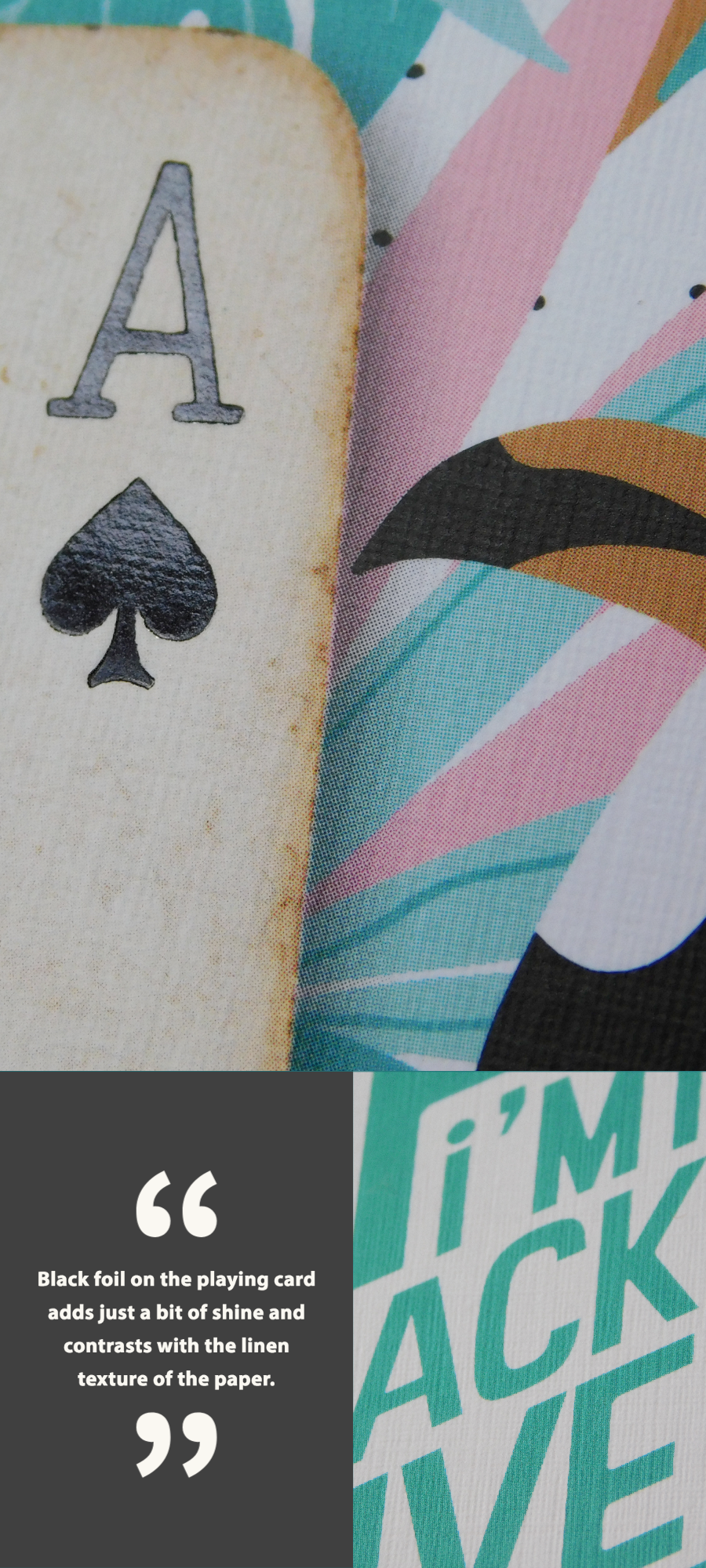
This year, we also wanted to include an element of cinematic “glitz & glamour” to each calendar page. So after spending some time looking at my design thus-far, I decided that the “A” & “V” spades on the card needed a little more attention. But how to best do this and not draw too much attention? We could use metallic ink? Or how about a UV coating? Or maybe a matte finish instead? After much deliberation, and fellow-designer consultation, I decided that the best way to achieve this balance was by using black foil to apply the “A” & “V” spades in the finishing process. This way the black of the “A” & “V” spades would still have a somewhat “normal” appearance of black print, BUT when the page is tilted ever so slightly it will catch the light and “pop,” creating the perfect subtle twist that I wanted the viewer to experience. The focal point of the design is the card, but adding the foil finish helps draw the eye to the clues embedded in the design, ultimately helping the viewer more easily detect the literal name of the movie represented! Form, function AND fun!
I gotta tell ya *once again, in the best “Ace” voice I can conjure* I’m RE-HEE-HEEAAALLY happy with the way this project turned out!
Press proofing on the HP Indigo® Digital Press and the final product.
Neenah’s CLASSIC® Linen
CLASSIC® Linen offers world-class elegance and a timeless tactile sensation. With a consistent finish on each side, it delivers both quality and flawless performance in 27 colors including 6 whites and 3 pearlized offerings, plus 5 duplex combinations. Digital-ready in 6 colors and 6 whites: Antique Gray, Avalanche White, Avon Brilliant White, Bare White, Baronial Ivory, Classic Natural White, Epic Black, Patriot Blue, Recycled 100 Bright White, Red Pepper, Solar White and White Pearl. For more information and a peek at color options, visit our friends at Neenah.
For ideas on how to blend a print campaign like this one with themed promotional items, you should definitely click here to check out our blog, "How Creative Design Can Maximize the Impact of Your Promotional Items."
To download "Ace Ventura" for your screens, click here.
Didn't receive a Sigler calendar this year? Never fear. Download a free printable version here.
If you’d like to make your next print project have maximum impact – Sigler's ready to help. CALL US AT (800) 750-6997 or jump right in and fill out our project planner.

