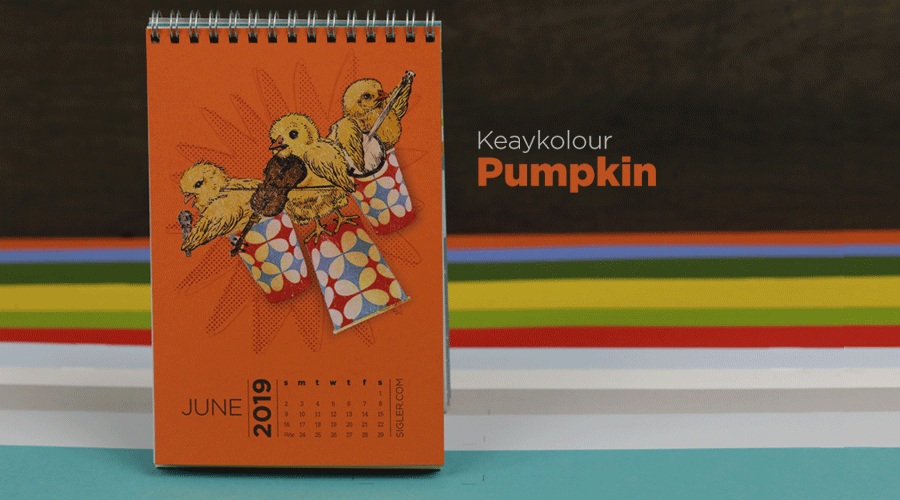
Let’s Get Literal (LGL) is a fun, interactive series of designs based on “literal” interpretations. LGL combines several things we love – music, design and creating campaigns that delight and engage people. This year’s calendar theme is BAND NAMES and/or ARTISTS. It’s up to the end-user to guess and then check their answers at LetsGetLiteral.com.
While June's Design Didn't Require "Wide Open Spaces," It DID Need White Opaque Bases
- Designer: Amy Sengbusch
- Band Name: Dixie Chicks
- Design Style: Vector Illustration
- Ink: Opaque White Ink + 4-Color Process (CMYK)
- Paper: Keaykolour Pumpkin
Liner notes from Amy
I am a huge fan of the Dixie Chicks. I am getting up there in years :) and the music from my era that I loved usually told a story or talked about feelings. (Corny, I know). I think the Dixie Chicks' songs do the same thing. I also love that it is all women and I love the fiddle playing. For some reason the word “Dixie” immediately made me think of those little Dixie cups I used to use when I was a kid. I thought it would be cute to have some little chicks using the cups as their stage. Dixie + Chicks = Dixie Chicks! Easy Peasy.
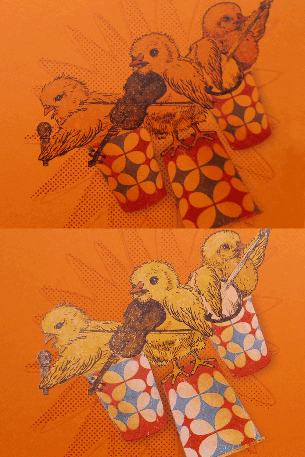
I wanted it to have a vintage feel combining photography with line drawing. I felt the page needed to be bright and fun. To get the color to “pop” on the pumpkin paper we had to print an opaque white base under the cups and the chicks. I love using colored paper, but sometimes you are limited with the colors you can use. Printing a white base changes that, giving you a lot more flexibility. I had so much fun creating this and I love the way it turned out!
Amy and Brian press checking.

Through the loop.

The Verdict
As you can see, orange paper really mutes your ink colors. As long as you keep this in mind, you can make this work to your advantage. Spot metallic silver looked fantastic since it is an opaque ink! Embossing or utilizing white foils would definitely look sharp on this paper as well.

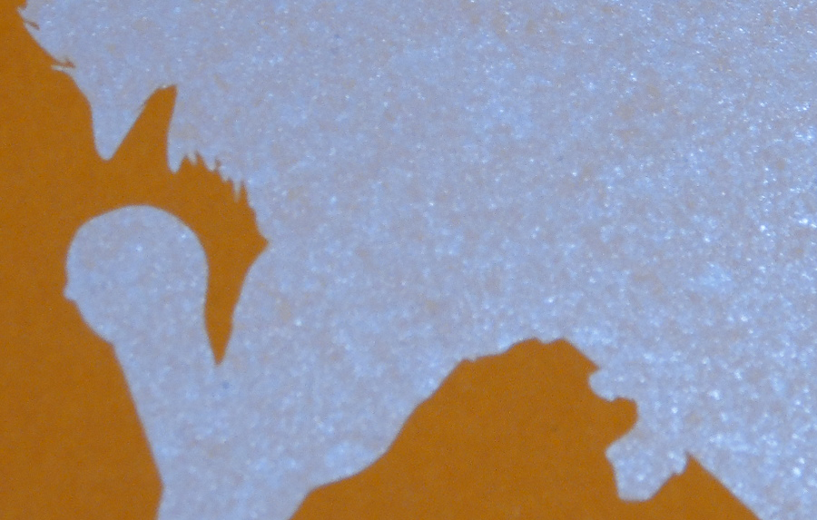
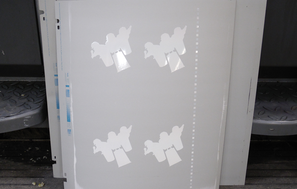
If you wish to maintain the original vibrancy of your ink colors on a dark colored sheet like this, as Amy mentioned, you would need to plan on having 1 if not 2 opaque white passes on the printing press before laying down your colored inks. This requires extra drying time, press plates and ink – but can really elevate your finished printed piece. For best results, your design should be pretty “forgiving”... very thin lines, tight registration and/or small type is not recommended. On Amy’s design, we only used the opaque white underneath the main shape, not the small dots and lines of the background burst for this very reason.
A close-up of just the base.
The opaque white press plates.
A side-by-side comparison with and without opaque white as a base. It definitely IS all about that base…
Encore
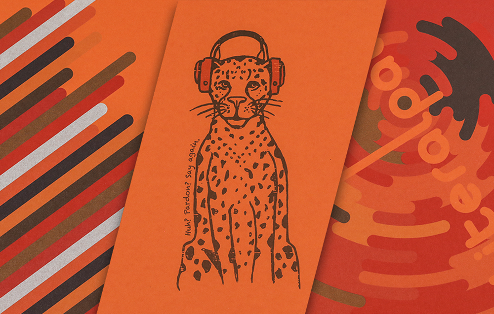
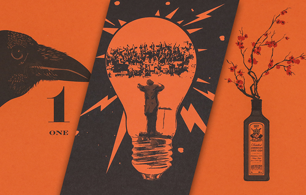
At the end of each month’s press run, we tossed in a stack of all 12 calendar paper colors for samples. Below shows what each month’s design looked like on Keaykolour Pumpkin.


If you’d like to make your next print project have maximum impact - we’re ready to help. CALL US AT (800) 750-6997 or jump right in and fill out our project planner.
Rock on!
Download "Dixie Chicks" for your screens here.
Didn't receive a calendar? Never fear. Download a free printable here.

